Note
Go to the end to download the full example code.
What you will learn
The problem
Ethiopian and Kenyan runners dominate long-distance athletics. Their success has inspired countless studies, documentaries, and debates trying to uncover why runners from these two nations seem to outperform the rest of the world.
But who is faster — Kenyan or Ethiopian runners?
To explore this question, we’ve collected official race data from hundreds of professional 10,000 m runners from both countries. Each record contains the runner’s name, nationality, and finishing time.
Just by looking at the data, it might seem that Kenyan runners tend to have slightly lower (faster) times — but appearances can be misleading. Random variation, race conditions, or sampling bias could all explain such differences.
To answer the question rigorously, we need a statistical approach. We will use hypothesis testing, specifically, a two-sample t-test, to compare the average times of Kenyan and Ethiopian runners and determine whether the observed difference is likely to be real or just due to chance.
In this lesson, we’ll move from posing the question to formulating a hypothesis, performing the test by hand, and finally reproducing it with Python on a larger dataset.
How to use this material
This material is taught as part of a 6 hour learning session. Your Kujenga instructor will have booked a time for an in-person or online two hour session. This means you have two hours to work to do either side of the session. Here is what you should do:
Before coming to the class: You should read through this entire page. At the section on calculating a confidence interval for a mean. If you get stuck look here. After that section you should simply read through and try to understand what we are doing.
Once you have read through, you should download this page as a Jupyter notebook or as Python code by clicking the links at the bottom of this page. You will need to have a Python environment set up on your computer or access via Google Colab see here. for info on how to set that up). Please make sure you have the notebook and a Python environment set up before the class. You should also download the Ethiopian data and the Kenyan data here.
During class: Your teacher will start by going through the theory for the t-test Please ask them questions and actively engage!
The methods
In this lesson, we will learn how to compare two groups of data and decide whether the difference we see between them is real or simply due to chance. This kind of reasoning where you weigh evidence to make decisions based on data is at the heart of both statistics and machine learning.
We will begin by introducing the idea of hypothesis testing, a structured way of asking:
“Is there enough evidence in the data to support a particular claim?”
To do this, we will learn how to:
Formulate null and alternative hypotheses that describe our assumptions about two groups.
Compute summary statistics (means and variances) to describe each group.
Use a t-statistic to measure how different two group means are, relative to their variability.
Determine whether the observed difference is statistically significant using the concept of a p-value and a significance level (α).
Before we run any Python code, we will first understand these ideas theoretically. You will see how the t-statistic formula arises from comparing two group averages and why it’s a standardized measure of difference.
Once we’ve established the theory, we’ll move to practice:
Selina will show you how to compute the t-statistic by hand using small samples of run times.
Then, Beimnet will recap the reasoning and demonstrate how to do the same test efficiently in Python, allowing us to analyze much larger datasets and visualize the results.
By the end of this lesson, you’ll not only know how to perform a t-test, but also why we do it and how this same logic underpins the way we evaluate models and decisions in machine learning.
For more information on the type of test we will look at, see here.
Why Do We Need a Test at All?
If we collect times from 10 Kenyan and 10 Ethiopian athletes, we might see one group’s average is lower. But averages alone don’t prove much; maybe that difference happened by chance. To reason rigorously, we use hypothesis testing. It lets us evaluate whether the difference we observe is likely real or just random variation.
Here in this lesson, we want to answer the question: Who is faster? Kenyan or Ethiopian runners? And more specifically, since in this lesson we’ll only cover one-sided t-tests, we’ll reframe the question to be: Are Kenyan runners faster than Ethiopian runners?
We’ll then set our hypothesis to be tested as follows:
Kenyan runners have a lower average time (are faster) than Ethiopian runners.
To test this, we set up two competing hypotheses:
Null Hypothesis (H₀): Kenyan and Ethiopian runners have the same average time. Any difference we see is due to random chance.
Alternative Hypothesis (H₁): Kenyan runners have a lower average time (are faster) than Ethiopian runners.
And mathematically, we can express these hypotheses as:
Where \(\mu\) represents the population mean time for each group.
Calculating the t-Statistic by Hand
In the following short video, Selina takes 10 times from each group, computes their averages, and applies the t-statistic formula:
She then compares her result to a critical value to decide whether the Kenyan runners are significantly faster.
Take a few minutes to watch her work through the math, notice how each part of the formula measures either difference in means or variation within each group.
Doing it in Python
Now that you’ve seen how to compute a t-statistic by hand, let’s review what those numbers mean. In the next video, Beimnet recaps the reasoning behind the t-test and shows how to implement it in Python. This allows us to analyze much larger datasets efficiently.
In this video:
We briefly recap what the null and alternative hypotheses represent,
explain why the significance level (α) matters, and
show how to perform the same t-test using Python — automating all the calculations Selina did manually.
This notebook complements that video by letting you run and modify the same code yourself. You’ll find each step below with explanations so you can experiment freely.
Loading in the data set
Let’s load our dataset of race times and prepare it for analysis.
import pandas as pd

# Load in times of runners
ETH_data = pd.read_csv('../data/ethiopia_10000m_runners.csv')
KEN_data= pd.read_csv('../data/kenyan_10000m_runners.csv')
Sampling and Comparing the Two Groups
# Selina used 10 runners from each group; let’s do the same here.

eth_data = ETH_data.sample(n=10, random_state=1)['Mark'].tolist()
ken_data = KEN_data.sample(n=10, random_state=2)['Mark'].tolist()
print(f"ETH DATA: {eth_data}")
print(f"KEN DATA: {ken_data}")

# Now, let’s compare their averages:
from statistics import mean
print("Average Ethiopian time:" ,mean(eth_data))
print("Average Kenyan time", mean(ken_data) )
# We see that the Kenyan runners have a lower average time, but is this difference significant?
# To answer that, we need to compute the t-statistic and compare it to a critical value.
ETH DATA: [1927.79, 1935.69, 1851.86, 1929.5, 1953.59, 1818.39, 1855.5, 1930.8, 1909.71, 1907.09]
KEN DATA: [1896.87, 1846.51, 1875.38, 1837.24, 1826.4, 1835.75, 1767.59, 1844.0, 1844.86, 1822.77]
Average Ethiopian time: 1901.992
Average Kenyan time 1839.737
Running the t-Test in Python
Now that we’ve set up our two samples and calculated their averages, we’re ready to formally test our hypothesis. Just as we did by hand, we’ll now use a t-test, but this time, Python will handle all the calculations for us.
The function ttest_ind() from the scipy.stats library performs a two-sample t-test. We’ll specify that we’re running a one-sided test (since we’re testing whether Kenyan runners are faster, not just different).
from scipy.stats import ttest_ind

t_stat, p_value= ttest_ind(ken_data, eth_data, alternative='less', equal_var=False)
print("T-statistics:", t_stat)
print("P-value:", p_value)
T-statistics: -3.522139129585767
P-value: 0.001326622635327722
Let’s unpack what this means:
t-statistic: measures how far apart the two sample means are, relative to the variation within each group.
p-value: tells us the probability of observing such a difference (or one more extreme) if the null hypothesis were true. In other words, if there were no real difference between the groups.
The smaller the p-value, the less likely it is that our observed difference happened just by random chance.
Making a Decision and Interpreting the Result
In statistics, we need a rule to decide when a difference is significant enough to reject the null hypothesis. That’s where the significance level, usually denoted by 𝛼 comes in. A common choice is 𝛼 = 0.05, meaning we accept a 5% risk of being wrong when concluding there’s a difference.
Let’s apply that rule to our result:
alpha = 0.05

if p_value < alpha:
    print("Reject the null hypothesis: Kenyan runners are statistically faster.")
else:
    print("Fail to reject the null hypothesis: No significant difference found.")
Reject the null hypothesis: Kenyan runners are statistically faster.
If the p-value is smaller than 0.05, it means the data provide strong evidence against the null hypothesis, just as Selina found in her manual example. But rather than computing it step by step, Python gives us a fast, reliable result that scales easily to much larger datasets.
This mirrors exactly what Selina did by hand, just powered by Python. The goal isn’t to replace the math, but to use it at scale and interpret the evidence more efficiently.
Checking the Critical Value
If you recall, in her video, Selina calculated the t-statistic and compared it to something called a critical value. This value acts like a cutoff point: it tells us how extreme our t-statistic must be before we decide the difference between groups is statistically significant. In other words, If our calculated t-statistic is more extreme than the critical value, the result is unlikely to have happened by chance — so we reject the null hypothesis. We can calculate this value directly in Python using the same logic Selina used by hand.
from scipy.stats import t

df = len(KEN_data) + len(ETH_data) - 2   # degrees of freedom (approximation)
alpha = 0.05                    # our significance level
critical_value = t.ppf(1 - alpha, df)

print("Critical Value:", critical_value)
print("Observed t-statistic:", t_stat)
Critical Value: 1.6525857836172075
Observed t-statistic: -3.522139129585767
Here’s how to interpret what you see:
Critical Value: the threshold beyond which a result is considered statistically significant.
t_statistic: our observed difference between the two groups, scaled by their variability.
If the t-statistic is smaller (more negative) than our critical value, it means our observed difference is strong enough to reject H_0. By checking both the p-value and the critical value, we see two sides of the same reasoning:
The p-value tells us how likely our result is if the null hypothesis were true.
The critical value tells us how far our result needs to go before we can call it significant.
Together, they give us both intuition and mathematical confirmation — a solid foundation for making data-driven conclusions.
Visualizing the Distributions
Before we move on, let’s take a moment to see what our data look like. Statistics often become much clearer when we visualize them, especially when comparing two groups.
By plotting the distribution of race times for both Ethiopian and Kenyan runners, we can get a quick visual impression of whether one group tends to have lower (faster) times than the other.
import matplotlib.pyplot as plt

plt.hist(ETH_data['Mark'], bins=10, alpha=0.6, label='Ethiopian Runners')
plt.hist(KEN_data['Mark'], bins=10, alpha=0.6, label='Kenyan Runners')
plt.xlabel('Time (seconds)')
plt.ylabel('Frequency')
plt.legend()
plt.title('Distribution of 10,000m Race Times')
plt.show()
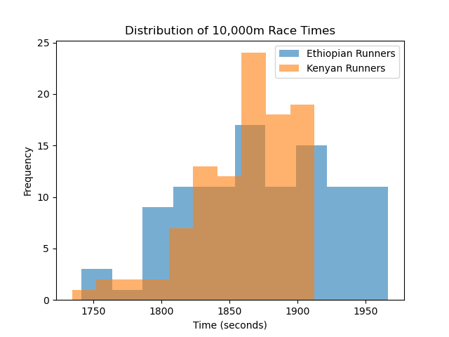
- If our hypothesis is correct, we might expect to see the Kenyan distribution slightly shifted to the left, toward smaller times.
This would visually confirm what our t-test already suggested: that Kenyan runners tend to record faster race times on average.
In statistics, visualization and computation go hand in hand. A plot helps you build intuition for what the numbers are saying. The t-test gives you the exact measure of confidence, but the plot gives you a story, it helps you see patterns, overlap, and how much the two groups differ in real terms. By comparing both, we can move beyond just accepting or rejecting a hypothesis and start understanding what the data are actually telling us.
- width:
100%
- align:
center
Exercise: Evaluating a Coach’s Claim about Training Methods
Below is an example that we can attempt. In this exercise you will apply your knowledge of hypothesis testing to evaluate a coaches claim about training methods
Scenario
A running coach believes that training at high altitutde improves athletes’ 10,000-meter race performance. According to the coach, athletes who train at higher elevation have better oxygen-utilisation efficiency, resulting in faster race times
To asses this claim, the coach records the race times (in seconds) for 50 athletes * 35 athletes trained at High Altitude (HA) * 25 athletes trained at Low Altitude (SL) Your task is to statistically determine whether high-altitude athletes are indeed significantly faster
Your task
*Define your null hypothesis H_0 and teh alternative hypothesis H_1 * What does the coach’s claim imply? * Should this be a one sided test or a two sided test?
Use the dataset below
This dataset contains the race times recorded by the coach
High Altitude (HA) Group - 25 athletes HA = [ 1931.2, 1928.4, 1942.1, 1919.7, 1935.3, 1922.8, 1917.4, 1940.9, 1938.2, 1926.5, 1933.1, 1924.6, 1930.4, 1918.9, 1936.7, 1921.3, 1941.5, 1934.2, 1916.8, 1929.9, 1937.4, 1923.1, 1932.8, 1927.6, 1919.3 ]
Sea Altitude (SL) Group - 25 athletes SL = [ 1958.6, 1961.9, 1949.5, 1965.2, 1953.8, 1962.3, 1947.9, 1956.7, 1970.1, 1959.4, 1963.8, 1950.7, 1966.4, 1948.8, 1961.2, 1957.9, 1972.6, 1960.5, 1954.1, 1968.3, 1952.7, 1971.4, 1955.9, 1964.8, 1958.1 ]
Perform a t-test Use scipy.stats.ttest_ind(): * Choose whether the test should be alternative=”less” or “two-sided”. * Decide whether equal variances can be assumed. Interpret your results Answer the following:
What does the p-value indicate about the coach’s claim?
Should you reject or fail to reject the null hypothesis?
Do the results support the idea that high-altitude training improves performance?
Visualize the comparison
Create:
A boxplot , A histogram , Or any plot that helps you compare the distributions
Discuss what you observe visually.
YOU CAN SUBMIT YOUR ASSIGNMENT HERE
Total running time of the script: (0 minutes 0.834 seconds)