Note
Go to the end to download the full example code.
What you will learn
The problem
Every year since 2005, the World Happiness Report has analysed the results of the Gallup World Poll, which is carried out in 160 countries (covering 99% of the world’s population). The pollsters contact a random sample of people in each country and ask them over 100 questions about their income, their health and their family. These questions include the following question about happiness:

People living in different countries give different answers. In the UK it is 6.94, making the UK 17th in the world for happiness. The top ranked country — rather surprisingly given a national stereotype of people who are reserved and don’t express their feelings very much — is Finland, with a score of 7.82. In general, Scandinavian and Northern European countries are ranked highest. The USA is 16th (0.03 points ahead of the UK). China, with a score of 5.59 and at 72nd place, is roughly in the middle of the table of the countries surveyed. Other mid-ranked countries include Montenegro, Ecuador, Vietnam and Russia. Further down the table, we find many African — Uganda and Ethiopia placed 117th and 131st, respectively, Middle Eastern countries — Iran is at 110 and Yemen at 132. The unhappiest country in the world in 2022 is Afghanistan, with an average happiness score of only 2.40.
The question is what makes people happy? One possible answer is that people are happier when they live longer. It is this relationship in data that we will explore in this lesson.
The methods
Here we will learn about plotting and looking for relationships in data; fitting straight lines through data points; understanding the slope and intercept of the line as parameters in a mathematical model; and showing that the parameters are the best possible fit to the data. These are all key data science skills and also the first steps towards machine learning. Specifically, we will find out more about a method known as linear regression.
Before we get to linear regression, we are going to go take detour into another part of mathematics: calculus. When you studied calculus at school or university, you probably didn’t associate it with finding statsitical relationships in data. But in machine learning, we are often interested in finding the minimum value of a function, and for that we need to go back to differentiation. Once we have done that, we will use differentiation to find the slope of a line which minimises the distances between points and a line through those points.
How to use this material
This material is taught as part of a 6 hour learning session. If you are doing this as part of an organised study group, your Kujenga instructor will have booked a time for an in-person or online two hour session. This means you have two hours to work to do either side of the session. Here is what you should do:
Before coming to the class: You should read through this page and get a feeling for the contents and watch the videos. At the section on differentiation, solve the paper and pencil exercise, but mainly you should read and start thinking about the material.
To do the computer exercise, you will need to have a Python environment set up on your computer or access via Google Colab (see here for info on how to set that up). Then you can download this page as a Jupyter notebook or as Python code by clicking the links at the bottom of this page. You should also download the data for the exercise. Run the code and focus on understanding what it does up to and including section Finding the best fit line.
During class: Your teacher will start by going through the theory for Finding the best fit line. Please ask them questions and actively engage! This is your chance to really understand what is going on.
After class: The section Exercise: look for other predictors of happiness gives the exercises you will need to hand in to your teacher in order to pass the section. Ask your teacher how you should submit your work.
Differentiation
Taking the derivative of a function is about finding an equation for the slope of the curve the function describes. When the derivative is zero, the slope is zero. For a recap on differentiation, this page provides a quick review. And here is Blessing from Univeristy of Lagos, Nigeria to lead you through an example!
In the example Blessing goes through she tries to find the value of \(m\) which minimises the function \((4-2m)^2\). To solve this problem, you can first multiply out the brackets to get
You can then take a derivative in order to calculate the slope of the function, to get
We then solve this equal to zero, because the function is a minimum when it has slope zero.
Problem solved.
Note that we use the letter \(m\) for the variable, while most often in school we use the letter \(x\) for the variable. In maths it really doesn’t matter what letter you use, as long as you are consistent, but we will later use \(m\) for the slope of a line, so we wanted to start using it already now.
If you can solve the problem above, you have the mathematics needed to work through the rest of this lesson. But, irrespective of whether you can solve the problem above or not, we recommend you have a look at Khan Academy’s Calculus 1 course. These calculus skills are part of the building blocks needed for the Kujenga course.
A line through the data
We already discussed looked at how the World Happiness Report documents the happiness of people across the world. Now, let’s load in that data to Python. In this video, David Sumpter steps through the code. Watch it first then try running the code yourself.
[VIDEO HERE]
from IPython.display import display
import pandas as pd
import matplotlib.pyplot as plt
import matplotlib
import numpy as np

# Read in the data, we shorten the variable names
happy = pd.read_csv("../data/HappinessData.csv",delimiter=';')
happy.rename(columns = {'Social support':'SocialSupport'}, inplace = True)
happy.rename(columns = {'Life Ladder': 'Happiness'}, inplace = True)
happy.rename(columns = {'Perceptions of corruption':'Corruption'}, inplace = True)
happy.rename(columns = {'Log GDP per capita': 'LogGDP'}, inplace = True)
happy.rename(columns = {'Healthy life expectancy at birth': 'LifeExp'}, inplace = True)
happy.rename(columns = {'Freedom to make life choices': 'Freedom'}, inplace = True)

# We just look at data for 2018 and dsiplay in table.
df=happy.loc[happy['Year'] == 2018]
display(df[['Country name','LifeExp','Happiness']])
     Country name    LifeExp  Happiness
10    Afghanistan  52.599998   2.694303
21        Albania  68.699997   5.004403
28        Algeria  65.900002   5.043086
45      Argentina  68.800003   5.792797
58        Armenia  66.900002   5.062449
...           ...        ...        ...
1654    Venezuela  66.500000   5.005663
1667      Vietnam  67.900002   5.295547
1678        Yemen  56.700001   3.057514
1690       Zambia  55.299999   4.041488
1703     Zimbabwe  55.599998   3.616480

[136 rows x 3 columns]
Creating the plot
The code below plots the average life expectancy of each of these countries against their happiness (life ladder) scores.
from pylab import rcParams
rcParams['figure.figsize'] = 14/2.54, 14/2.54
matplotlib.font_manager.FontProperties(family='Helvetica',size=11)

def plotData(df,x,y):
    fig,ax=plt.subplots(num=1)
    ax.plot(x,y, data=df, linestyle='none', markersize=5, marker='o', color=[0.85, 0.85, 0.85])
    for country in ['United States','United Kingdom','Croatia','Benin','Finland','Yemen']:
        ci=np.where(df['Country name']==country)[0][0]
        ax.plot(  df.iloc[ci][x],df.iloc[ci][y], linestyle='none', markersize=7, marker='o', color='black')
        ax.text(  df.iloc[ci][x]+0.5,df.iloc[ci][y]+0.08,  country)

    ax.set_xticks(np.arange(30,90,step=5))
    ax.set_yticks(np.arange(11,step=1))
    ax.set_ylabel('Average Happiness (0-10)')
    ax.set_xlabel('Life Expectancy at Birth')
    ax.spines['top'].set_visible(False)
    ax.spines['right'].set_visible(False)
    ax.set_xlim(47,78)
    ax.set_ylim(2.5,8.1)
    return fig,ax

fig,ax=plotData(df,'LifeExp','Happiness')

plt.show()
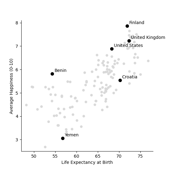
Each circle in the plot is a country. The x-axis shows the life expectancy in the country and the y-axis shows the average ranking of life satisfaction, on the 0 to 10 scale. In general, the higher the life expectancy of a country, the higher the happiness (life satisfaction) there.
Drawing a line
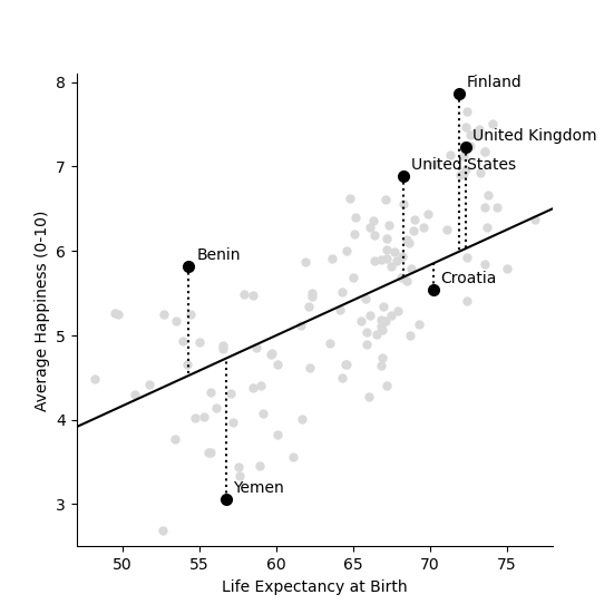
One way to quantify this relationship is to draw a straight line through the points, showing how happiness increases with life expectancy. For example, imagine that for every 12 extra years which people live in a country they are one point happier. The equation for happiness in this case would then look like this,
in this case, if the average life expectancy in the country is 60 then the equation above predicts the happiness to be 60/12=5. If the life expectancy is 78 then average happiness is predicted to be 78/12=6.5. And so on…
We can draw this equation in the form of a straight line going through the cloud of country points, as shown below.
# Setup parameters: m is the slope of the line
# And calculate a line with that slope.

m=1/12
Life_Expectancy=np.arange(0.5,100,step=0.01)
Happiness= m*Life_Expectancy

# Plot the data and the line
fig,ax=plotData(df,'LifeExp','Happiness')
ax.plot(Life_Expectancy, Happiness, linestyle='-', color='black')
df=df.assign(Predicted=np.array(m*df['LifeExp']))
for country in ['United States','United Kingdom','Croatia','Benin','Finland','Yemen']:
    ci=np.where(df['Country name']==country)[0][0]
    ax.plot(  [df.iloc[ci]['LifeExp'],df.iloc[ci]['LifeExp']] ,[ df.iloc[ci]['Happiness'],df.iloc[ci]['Predicted']] ,linestyle=':', color='black')
plt.show()
Try it yourself!
Download the code by clicking on the link below and try changing the slope and the intercept of the line above by changing the values 1/12 and replotting the line. See if you can find a line that lies closer to the data points.
The sum of squares
Each of the dotted lines above show how far the line – which predicts that happiness is one twelfth of life expectancy – is from the data for each of the six highlighted countries. For example, the USA has a happiness score of 6.88 and an average life expectancy of 68.3. The first equation (figure 2b) predicts
Which means that the squared distance between the prediction and reality is
The table below shows the predicted value and the squared distance between prediction and reality for each country. We then sum these squared distances to get an overall measure of how far our predictions our from reality. This is done below.
df=df.assign(SquaredDistance=np.power((df['Predicted'] - df['Happiness']),2))
display(df[['Country name','Happiness','Predicted','SquaredDistance']])

Model_Sum_Of_Squares = np.sum(df['SquaredDistance'])

print('The model sum of squares is %.4f' % Model_Sum_Of_Squares)
     Country name  Happiness  Predicted  SquaredDistance
10    Afghanistan   2.694303   4.383333         2.852822
21        Albania   5.004403   5.725000         0.519260
28        Algeria   5.043086   5.491667         0.201225
45      Argentina   5.792797   5.733334         0.003536
58        Armenia   5.062449   5.575000         0.262709
...           ...        ...        ...              ...
1654    Venezuela   5.005663   5.541667         0.287300
1667      Vietnam   5.295547   5.658333         0.131614
1678        Yemen   3.057514   4.725000         2.780510
1690       Zambia   4.041488   4.608333         0.321313
1703     Zimbabwe   3.616480   4.633333         1.033991

[136 rows x 4 columns]
The model sum of squares is 82.8467
Finding the best fit line
We have drawn a line. But the question is what the ‘best’ line is? Blessing goes through the theory below and then we will calculate the best fitting line for the data above.
Sum of squares
Let’s start by formulating this problem mathematically. For each country \(i\), we have two values: the life satisfaction, which I will call \(y_i\) and life expectancy, which I will call \(x_i\) . For example, when \(i=\) USA then \(i=x_i=6.88\) and \(y_i=68.3\).
Now, let’s denote the slope of the line as \(m\) (in the plot above \(m=1/12\)) and repeat the caluclation we made above but with letters instead of numbers. First we note that
The little “hat” in \(\hat{y_i}\) denotes that it is a prediction (rather than the measured value itself, which is \(y_i\)). The squared distance between the prediction and outcome is written as
All I am doing is rewriting the same calculation we did above with numbers, but now with the letters. The reason for doing this is that our aim is to find an equation for the value of \(m\) which minimises the sum of square distances.
The next step is to write out the sum
The above equation is can be written in shorthand form (using the sum notation we met in the section on our average friend as
where \(n=136\) is the number of countries.
Back to differentiation
We want to find the value of \(m\) which minimises this sum of squares. But how do we do this?
The answer is differentiation. We now want to find the value of \(m\) which minimises the sum of squares. The equation above is more complicated than the one we used in the section on Differentiation.
Although the algebra is more complicated, we can use exactly the same logic to solve the problem above, of finding the value of \(m\) which minimises this sum of squares. We first take the derivative
Although this particular step involves alot of algebra, notice that we are doing exactly the same as in the example above. Another thing that that can confuse students is that we differentiate with respect to \(m\). In school, we often use the letter \(x\) for the variable name and \(m\) for a constant. Here it is the other way round. The data \(x_i\) and \(y_i\) are constants (measurements from countries) and \(m\) is the variable we differentiate for.
We now write the sum above in shorthand as
and we solve equal to zero (to find the point at which it is minimized, and the slope is zero) to get
Moving the \(m\) to the left hand side gives
Let’s use our newly found equation to calculate the line that best fits the data.
df=df.assign(SquaredLifEExp=np.power(df['LifeExp'],2))
df=df.assign(HappinessLifEExp=df['LifeExp'] * df['Happiness'])

m_best = np.sum(df['HappinessLifEExp'])/np.sum(df['SquaredLifEExp'])
print('The best fitting line has slope m = %.4f' % m_best)
The best fitting line has slope m = 0.0856
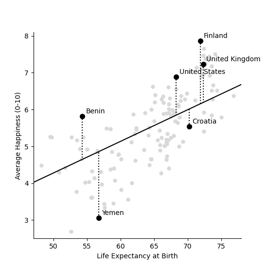
Our intial guess of \(m = 1/12 = 0.0833\) wasn’t so far away from the best fitting value. But this new slope is slightly closer to the data. We can now plot this and recalculate the model sum of squares
Life_Expectancy=np.arange(0.5,100,step=0.01)
Happiness= m_best*Life_Expectancy

fig,ax=plotData(df,'LifeExp','Happiness')
ax.plot(Life_Expectancy, Happiness, linestyle='-', color='black')
df=df.assign(Predicted=np.array(m_best*df['LifeExp']))
for country in ['United States','United Kingdom','Croatia','Benin','Finland','Yemen']:
    ci=np.where(df['Country name']==country)[0][0]
    ax.plot(  [df.iloc[ci]['LifeExp'],df.iloc[ci]['LifeExp']] ,[ df.iloc[ci]['Happiness'],df.iloc[ci]['Predicted']] ,linestyle=':', color='black')

plt.show()

df=df.assign(SquaredDistance=np.power((df['Predicted'] - df['Happiness']),2))

Model_Sum_Of_Squares = np.sum(df['SquaredDistance'])
print('The model sum of squares is %.4f' % Model_Sum_Of_Squares)
The model sum of squares is 79.9469
Again, this sum of squares is slightly smaller than the value we got above for \(m = 1/12\)
Including the Intercept
An equation for a straight line usually has two components a slope \(m\) which we have already seen and an intercept \(k\), which so far we have assumed is zero. We can write the equation for a straight line as
We now look at how we can improve the fit of the model by including this intercept.
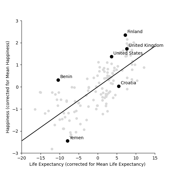
We start by shifting the data so that it has a mean (average) of zero. To do this we simply take away the mean value from both life expectancy and from happiness. Then replot the data
df=df.assign(ShiftedLifeExp=df['LifeExp'] - np.mean(df['LifeExp']))
df=df.assign(ShiftedHappiness=df['Happiness'] - np.mean(df['Happiness']))

fig,ax=plotData(df,'ShiftedLifeExp','ShiftedHappiness')
ax.set_ylabel('Happiness (corrected for Mean Happiness)')
ax.set_xlabel('Life Expectancy (corrected for Mean Life Expectancy) ')
ax.set_xticks(np.arange(-30,30,step=5))
ax.set_yticks(np.arange(-5,5,step=1))
ax.set_xlim(-20,15)
ax.set_ylim(-3,3)
plt.show()
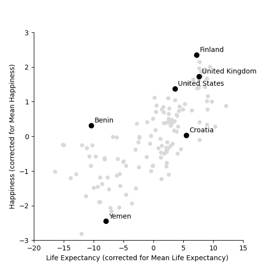
This graph shows us that, for example, Yemen is almost -2.5 points below the world average for happiness and has a life expectency 8 years shorter than the average over all countries in the world. The United States life expectancy is around 3.5 years longer than the average and the citizens of the USA are about 1.3 points happier than average. It is worth noting that the correction is for country averages and does not account for the size of the populations of these various countries. It does however give us a new way of seeing between country differences.
Let’s now try to find the best fit line which goes through these data points.
df=df.assign(SquaredLifEExp=np.power(df['ShiftedLifeExp'],2))
df=df.assign(HappinessLifEExp=df['ShiftedLifeExp'] * df['ShiftedHappiness'])

m_best = np.sum(df['HappinessLifEExp'])/np.sum(df['SquaredLifEExp'])
print('The best fitting line has slope m = %.4f' % m_best)

Life_Expectancy=np.arange(-50,50,step=0.01)
Happiness= m_best*Life_Expectancy

fig,ax=plotData(df,'ShiftedLifeExp','ShiftedHappiness')
ax.plot(Life_Expectancy, Happiness, linestyle='-', color='black')
ax.set_ylabel('Happiness (corrected for Mean Happiness)')
ax.set_xlabel('Life Expectancy (corrected for Mean Life Expectancy) ')
ax.set_xticks(np.arange(-30,30,step=5))
ax.set_yticks(np.arange(-5,5,step=1))
ax.set_xlim(-20,15)
ax.set_ylim(-3,3)

plt.show()
The best fitting line has slope m = 0.1226
This line appears to fit better than the one we fitted earlier! It lies closer to the points and better capture the relationship in the data. To test whether this is indeed the case we can calculate the sum of squares between this new line and the shifted data. This is as follows
df=df.assign(Predicted=np.array(m_best*df['ShiftedLifeExp']))
df=df.assign(SquaredDistance=np.power((df['Predicted'] - df['ShiftedHappiness']),2))

Model_Sum_Of_Squares = np.sum(df['SquaredDistance'])
print('The model sum of squares is %.4f' % Model_Sum_Of_Squares)
The model sum of squares is 71.7665
This new line through the data is better! It has a smaller sum of squares.
The mean values are calculated as follows
Using this notation, the equation for the line through the data is
Just to remind you about the notation. The predicted value has a hat over it, while the mean values have a bar over them. We can rearrange this equation to get
Notice that this is an equation for a straight line, so we can write
Let’s apply this to data and plot the line again
k_best = np.mean(df['Happiness']) - m_best*np.mean(df['LifeExp'])

Life_Expectancy=np.arange(0.5,100,step=0.01)
Happiness= m_best*Life_Expectancy + k_best

fig,ax=plotData(df,'LifeExp','Happiness')
ax.plot(Life_Expectancy, Happiness, linestyle='-', color='black')
df=df.assign(Predicted=np.array(m_best*df['LifeExp']+k_best))
for country in ['United States','United Kingdom','Croatia','Benin','Finland','Yemen']:
    ci=np.where(df['Country name']==country)[0][0]
    ax.plot(  [df.iloc[ci]['LifeExp'],df.iloc[ci]['LifeExp']] ,[ df.iloc[ci]['Happiness'],df.iloc[ci]['Predicted']] ,linestyle=':', color='black')

plt.show()

print('The slope of the line is m = %.4f and the intercept is k = %.4f' % (m_best,k_best))
print('An increase in life expectancy of %.4f years is associated with one extra point of happiness' % (1/m_best))

df=df.assign(SquaredDistance=np.power((df['Predicted'] - df['Happiness']),2))
Model_Sum_Of_Squares = np.sum(df['SquaredDistance'])

print('The model sum of squares is still %.4f' % Model_Sum_Of_Squares)
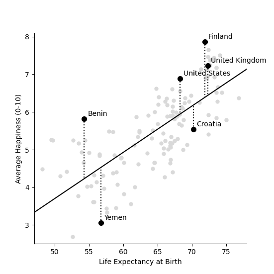
The slope of the line is m = 0.1226 and the intercept is k = -2.4252
An increase in life expectancy of 8.1580 years is associated with one extra point of happiness
The model sum of squares is still 71.7665
Now we have it. By shifting back to the original co-ordinates we can find the best fitting line through the data. Notice that the sum of squares is unaffected by shifting the line back again, since the distances from the points to the line are unaffected.
Too Much Math? There’s a Shortcut for That
So, we’ve just done all the math by hand,pretty satisfying, right? But now the big question is… could there be an easier way? Maybe there’s a Python library that just does all the heavy lifting for us?
Yep — that’s where statsmodels comes in. It basically runs the same linear regression we just worked out by hand, but behind the scenes. This is exactly how a Machine Learning Engineer would handle it in practice — less manual math, more letting Python do the work.
What we’re doing here is just checking: does statsmodels give us the same m and k If they do, that means our manual derivation was spot on!
Let’s test it out — and Victoria from Kenya will walk you through the code.
- N.B. Make sure you have statsmodels installed in your Python environment:
pip install statsmodels or if you are using conda: conda install statsmodels
[VIDEO HERE]
# Import the Ordinary Least Squares (OLS) regression tool from statsmodels
# "ols" stands for Ordinary Least Squares – the most common method for fitting a line.
from statsmodels.formula.api import ols

# Fit a linear regression model using statsmodels.
# The formula 'Happiness ~ LifeExp' means:
# "predict Happiness using LifeExp as the independent variable".
model = ols('Happiness ~ LifeExp', data=df).fit()

# Display the model parameters:
# Intercept corresponds to 'k', and the coefficient for LifeExp corresponds to 'm'.
print("\nStatsmodels estimated parameters (Intercept and LifeExp):")
print(model.params)
Statsmodels estimated parameters (Intercept and LifeExp):
Intercept   -2.416310
LifeExp      0.122579
dtype: float64
We can say (roughly speaking) that for every 8 years of life expectancy country citizens are about 1 point happier on a scale of 0 to 10. It isn’t the whole truth (see the word of warning below), but it isn’t entirely misleading either.
Interpretting the data
Although there is a relationship between these two variables, this does not mean that life expectancy causes happiness. One example of a causal relationship between life expectancy and happiness would be one where people are happier because they know they are going to live longer. Less direct, but still causal relationship would be that people are happier because they have access to better healthcare, or that they have less worries about the health of their children and loved ones. There are many seperate factors which can cause both life expectancy and happiness to increase. For example, a country with a high GDP per capita is likely to have both a high life expectancy and a high happiness score (you can test this in the next section). It may even be the case that happy people co-operate more and build better healthcare systems, which in turn leads to longer life expectancy.
John Helliwell and his colleagues, who collated the data for the World Happiness report, emphasise the importance of, what they call, social foundations. in creating a happier world. Happiness arises when we have choices, when the people around us are generous and sociable, when we don’t live in poverty and when we are likely to live long lives. But we have to be careful when interpreting these results. We cannot know, from cross-country comparison data alone, which factors cause happiness or merely happen to correlate with it. We don’t know if better healthcare or better social support cause an increase in happiness, or the other way around. What we do know is that people in more stable, more prosperous countries, with greater social support tend to describe themselves as happier.
Think again about yourself. We cannot rely on national questionnaire results to plan our own path to personal happiness. The majority of the factors which Helliwell and his colleagues have studied are not under your control. They are determined by the country you happen to be born in. In some parts of the world people have access to high quality healthcare and do not experience corruption on an everyday basis. In others they don’t. Access to happiness isn’t entirely a personal choice, it is just a matter of living in the right country at the right time.
Exercise: look for other predictors of happiness
Look at other variables that might predict happiness in the data. You can find the values for these in the dataframe under LogGDP, SocialSupport, Freedom, Generosity and Corruption. Full definitions can be found on the World Happiness Report website.
df[['Country name','LogGDP','SocialSupport','Freedom','Generosity','Corruption']].head()
Choose one of the variables and go through the steps we have done for life expectancy above, applying them to your chosen variable. Find a different variable that predicts happiness. Make a plot with a fitted line through the data.
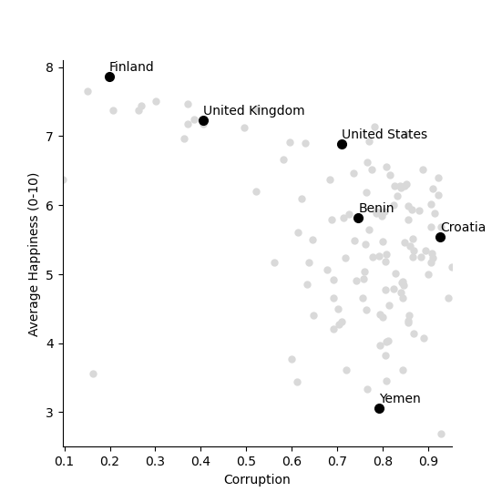
Once you have shown the relationship in the data then write Give one argument why it might be correlated with but does not cause happiness. In the code below we have plotted the relationship between happiness and perceived corruption in countries, as an example.
def plotData(df,x,y):
    fig,ax=plt.subplots(num=1)
    ax.plot(x,y, data=df, linestyle='none', markersize=5, marker='o', color=[0.85, 0.85, 0.85])
    for country in ['United States','United Kingdom','Croatia','Benin','Finland','Yemen']:
        ci=np.where(df['Country name']==country)[0][0]
        ax.plot(  df.iloc[ci][x],df.iloc[ci][y], linestyle='none', markersize=7, marker='o', color='black')
        ax.text(  df.iloc[ci][x],df.iloc[ci][y]+0.08,  country)

    ax.set_yticks(np.arange(11,step=1))
    ax.set_ylabel('Average Happiness (0-10)')
    ax.set_xlabel(x)
    ax.spines['top'].set_visible(False)
    ax.spines['right'].set_visible(False)
    ax.set_xlim(np.min(df['Corruption']),np.max(df['Corruption']))
    ax.set_ylim(2.5,8.1)
    return fig,ax

fig,ax=plotData(df,'Corruption','Happiness')

plt.show()
Using regression in applications
We have now seen how to use linear regression to find a line through data points. In the video below we talk to several reasearchers who use linear regression in their work.
Total running time of the script: (0 minutes 2.456 seconds)