Note
Go to the end to download the full example code.
The SIR model
In the SIR model, the rate of change of susceptible individuals is
and the rate of change of infectives is
The constant \(b\) is the rate of contact between people and \(c\) is the rate of recovery. We can also write down an equation for recovery as follows,
In this model \(S\), \(I\) and \(R\) are proportions of the population. Summing them up gives \(S+I+R=1\), since everyone in the popultaion is either susceptible, infective or recovered.
Let’s now solve these equations numerically. We start by importing the libraries we need from Python.
import numpy as np
import matplotlib.pyplot as plt
import matplotlib
from pylab import rcParams
matplotlib.font_manager.FontProperties(family='Helvetica',size=11)
rcParams['figure.figsize'] = 9/2.54, 9/2.54
from scipy import integrate
Now we define the model. This code creates a function which we can use to simulate differential equations (1) and (2). We also define the parameter values. You can change these to see how changes to the paramaters leads to changes in the outcome of the model.
Investigate yourself what happens when \(b=1/3, 1/6, 1/10\).
# Parameter values
beta = 1/2
gamma = 1/7

# Differential equation
def dXdt(X, t=0):
    return np.array([  - beta*X[0]*X[1] ,              #Susceptible X[0] is S
                      beta*X[0]*X[1]   - gamma*X[1],       #Infectives X[1] is I
                      gamma*X[1]])                      #Recovered X[2] is R
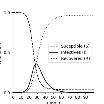
We solve the equations numerically and plot solution over time.
def plotEpidemicOverTime(ax,t,S,I,R):

    ax.plot(t, S, '--',color='k', label='Suceptible (S)')
    ax.plot(t, I  , '-',color='k', label='Infectives (I)')
    ax.plot(t, R  , ':',color='k', label='Recovered (R)')
    ax.legend(loc='best')
    ax.set_xlabel('Time: t')
    ax.set_ylabel('Population')
    ax.spines['top'].set_visible(False)
    ax.spines['right'].set_visible(False)
    ax.set_xticks(np.arange(0,100,step=10))
    ax.set_yticks(np.arange(0,1.01,step=0.5))
    ax.set_xlim(0,100)
    ax.set_ylim(0,1)


t = np.linspace(0, 100,  1000)               # time
X0 = np.array([0.9999, 0.0001,0.0000])      # initially 99.99% are uninfected
X = integrate.odeint(dXdt, X0, t)           # uses a Python package to simulate the interactions
S, I, R = X.T
fig,ax=plt.subplots(num=1)
plotEpidemicOverTime(ax,t,S,I,R)
plt.show()
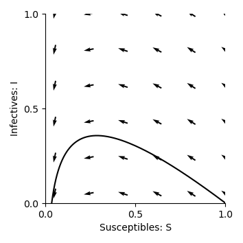
Phase Planes
In this section, Emily introduces the concept of phase planes in the video below, using the SIR model as an example.
The material that follows recaps what is covered in the video, with supporting code and explanations to help you explore phase planes for yourself.
What are Phase Planes, and Why Do We Use Them?
Phase planes provide a powerful visualization method for dynamic systems. Instead of observing each variable separately over time, phase planes plot one variable against another. In our case, a common representation for the SIR model is the interaction between the Susceptible (S) and Infected (I) groups. This is used both the video, and further below in the code examples.
This visualization allows us to better understand complex system behaviors, such as:
The spread of disease over time
Stabilization points (equilibrium)
The eventual decline or extinction of an epidemic
Phase planes highlight crucial relationships, equilibrium points, and system behavior that can inform predictions about the long-term outcomes of an epidemic.
Key Components of Phase Planes
To fully understand phase planes, let’s examine their key components:
- Axes:
The axes of a phase plane represent the system variables, which is Susceptible (S) and Infected (I) in this case. By plotting one variable against another, we can see how these groups interact directly, rather than just observing their individual changes over time.
- Trajectories:
Trajectories portray the state of the system as it evolves. For the SIR model in particular, the trajectory describes how the numbers of susceptible and infected individuals change in relation to one another as the epidemic progresses over time.
- Directional Arrows:
These arrows on the phase plane indicate the direction of movement over time, showing how the system transitions between states. They guide us through the epidemic’s progression, pointing from higher susceptibility toward states of greater infection or recovery.
Below is the first example of a phase plane showing how the SIR system evolves over time, with Susceptible (S) on the x-axis and Infected (I) on the y-axis.
beta = 1/2
gamma = 1/7

def plotPhasePlane(ax,S,I):
    ax.plot(S, I, '-',color='k')
    ax.set_xlabel('Susceptibles: S')
    ax.set_ylabel('Infectives: I')
    ax.spines['top'].set_visible(False)
    ax.spines['right'].set_visible(False)
    ax.set_xticks(np.arange(0,1.01,step=0.5))
    ax.set_yticks(np.arange(0,1.01,step=0.5))
    ax.set_ylim(0,1)
    ax.set_xlim(0,1)

def drawArrows(ax,dXdt):
    x = np.linspace(0.05, 1 ,6)
    y = np.linspace(0.05, 1, 6)
    X , Y  = np.meshgrid(x, y)
    dX, dY, dZ = dXdt([X, Y,1-X-Y])
    #Make in to unit vectors.
    M = np.hypot(dX,dY)
    dX = dX/M
    dY = dY/M
    ax.quiver(X, Y, dX, dY, pivot='mid')

fig,ax=plt.subplots(num=1)
plotPhasePlane(ax,S,I)
drawArrows(ax,dXdt)
plt.tight_layout()
plt.show()
Equilibrium Points and Nullclines
One essential element of phase planes is the determination of equilibrium points. These points occur where the rates of change for both Susceptible (S) and Infected (I) are zero. The lines where the rate of change of a variable is equal to zero are called nullclines. The intersection of these nullclines determines the equilibrium points, which are crucial to understanding how an epidemic evolves.
Similar to the predator prey model, we can find the equilibria for the infected population, where the rate at which people become infected equals the rate at which they recover. This is done by solving:
This occurs either when \(I=0\) (no one has the disease) or when \(S=\gamma/\beta\).
For the susceptible population:
which simplifies to \(I = 0\) or \(S = 0\). These resultant values are all nullclines of this system.
We can now plot the nullcline \(S=\gamma/\beta\) on the phase plane:
import numpy as np
import matplotlib.pyplot as plt
from scipy.integrate import odeint

# Parameters
beta = 1/2
gamma = 1/7

# Integrate the system
t = np.linspace(0, 100, 1000)
X0 = np.array([0.9999, 0.0001, 0.0000])
X = integrate.odeint(dXdt, X0, t)
S, I, R = X.T

fig,ax=plt.subplots(num=1)
# Include nullcline
ax.plot([gamma/beta,gamma/beta],[-100,100],linestyle=':',color='k')
plotPhasePlane(ax,S,I)
drawArrows(ax,dXdt)
plt.tight_layout()
plt.show()
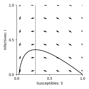
Now, we can see that this nullcline passes through the trajectory at its peak. This is because the rate of change of infections (\(\frac{dI}{dt}\)) becomes zero when \(S=\gamma/\beta\), and the number of infected individuals reaches the maximum value possible for the system. This visual insight helps us understand how the number of infections evolves over time, and the nullclines highlight important thresholds in disease spread. The effects of interventions, such as vaccination or changes in contact rates can also be visualised in this way, by showing how they might shift the trajectory or alter the nullclines.
Impact of Parameters
Now, we can investigate what happens to the phase planes when we change the values of \(\beta\) and \(\gamma\). In our previous code examples, the \(\beta\) value was \(\frac{1}{2}\), which is the rate of contact between people, or transmission rate. What do you think will happen to the phase plane trajectory if we increase this value? How will the nullcline be impacted? You can change the “beta” value in the code block to test your hypothesis.
Answer:
As \(\beta\) increases, the infection rate becomes faster, which means the disease spreads more quickly. This leads to a faster rise in the number of infected individuals, and the trajectory in the phase plane will become steeper. The peak of the trajectory will also become higher, as more individuals get infected more quickly before reaching the recovery phase.
The nullcline, which represents the point where the rate of change of infected individuals is zero (i.e., where the number of infections and recoveries are balanced), shifts to the left as \(\beta\) increases. This indicates that, for a higher transmission rate, fewer susceptible individuals remain in the population when the epidemic reaches equilibrium. Essentially, a larger number of people are infected earlier, so there are fewer susceptible individuals left when the system reaches a stable state.
Similarly, the \(\gamma\) value was set to \(\frac{1}{7}\), representing the recovery rate. What happens to the trajectory and nullcline for the phase plane when this value is increased?
Answer:
A flatter trajectory and a lower peak (due to quicker recovery) will be observed. In addition, the nullcline shifts to the right, indicating a higher number of susceptible individuals at equilibrium.
This is because the quicker recovery of individuals causes the epidemic to peak and decline more quickly, leaving a larger proportion of the population susceptible at the point of equilibrium.
Additional questions:
When a high \(\gamma\) or low \(\beta\) value is used, the trajectory does not return to the x-axis after peaking. Why might this be happening?
We have been initialising the models with 99.99% of the population as susceptible, and only 0.01% infected. How are the phase planes affected when changing this proportion?
Total running time of the script: (0 minutes 0.183 seconds)